Understanding My Candlestick Charts: A Mathematical Perspective
Duration: 1:15
Views: 85
Submitted: 5 months ago
Submitted by:
Description:
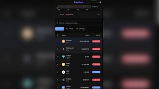
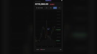
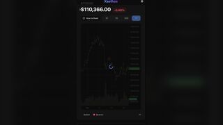
It is my understanding that my candlestick Charts probably need an explanation to users since I’m the one who engineered it and need to break it down mathematically, so here it is!
Understanding Stateless Warriors Candlestick Charts: A Mathematical Perspective….
What is a Candlestick Chart?
A candlestick chart is a technical analysis tool that displays price movements over time using visual elements called "candles." Each candle represents a specific time period (e.g., 1 hour, 1 day) and encodes four critical price points: Open (O), High (H), Low (L), and Close (C).
The Four Key Data Points (OHLC)
Open (O)
The first transaction price at the start of the time period. Mathematically: O = P(t₀)
High (H)
The maximum price reached during the period. H = max(P(t)) for t ∈ [t₀, t₁]
Low (L)
The minimum price reached during the period. L = min(P(t)) for t ∈ [t₀, t₁]
Close (C)
The last transaction price at the end of the period. C = P(t₁)
Candlestick Anatomy
Body (Real Body)
The rectangular portion between Open and Close prices.
Body Height = |C - O|
• Green/White Body: Bullish candle where C > O (price increased)
• Red/Black Body: Bearish candle where C < O (price decreased)
Wicks/Shadows (Upper and Lower)
Thin lines extending from the body showing price extremes.
Upper Wick Length = H - max(O, C)
Lower Wick Length = min(O, C) - L
These represent rejected price levels where buyers or sellers couldn't maintain control.
Key Mathematical Metrics
Price Range = H - L
Total volatility during the period
Body Percentage = |C - O| / (H - L) × 100%
Strength of directional movement. High % = strong trend, Low % = indecision
Upper Wick Ratio = (H - max(O,C)) / (H - L)
Selling pressure indicator. High ratio = strong rejection at higher prices
Lower Wick Ratio = (min(O,C) - L) / (H - L)
Buying pressure indicator. High ratio = strong support at lower prices
Price Change = ((C - O) / O) × 100%
Percentage gain/loss for the period
Interpreting Candlestick Patterns
Strong Bullish Candle
C >> O, small/no upper wick, small/no lower wick
Interpretation: Strong buying pressure, buyers dominated from open to close
Strong Bearish Candle
O >> C, small/no upper wick, small/no lower wick
Interpretation: Strong selling pressure, sellers dominated throughout
Doji (Indecision)
O ≈ C (body height ≈ 0), long wicks
Interpretation: Market equilibrium, equal buying/selling pressure, potential trend reversal
Hammer/Inverted Hammer
Small body, long lower wick (2-3× body height), appears after downtrend
Interpretation: Selling pressure rejected, potential bullish reversal
Shooting Star
Small body, long upper wick (2-3× body height), appears after uptrend
Interpretation: Buying pressure rejected at highs, potential bearish reversal
Volume Indicators
Volume bars at the bottom show trading activity. Volume (V) represents the total quantity traded during the period.
• Green Volume: Paired with bullish candle (C > O)
• Red Volume: Paired with bearish candle (C < O)
Volume Confirmation:
High volume + large body = Strong conviction in direction
Low volume + large body = Weak move, potential reversal
Volume Spike = Increased interest, often at trend changes or breakouts
Advanced Statistical Concepts
Volatility (σ)
Standard deviation of price changes over n periods. Higher candlestick ranges indicate higher volatility.
σ = √(Σ(Pᵢ - μ)² / n)
Moving Average Convergence
When close prices cross above/below moving averages, it signals potential trend changes.
MA(n) = (Σ Cᵢ) / n, for i = 1 to n
Support and Resistance Levels
Price levels where L or H values cluster, indicating psychological barriers.
Multiple candles with similar lows = Support
Multiple candles with similar highs = Resistance
How to Read Your Chart
Start from left to right (chronological time progression)
Identify overall trend: Series of higher highs and higher lows = uptrend; Lower highs and lower lows = downtrend
Analyze individual candles for strength and rejection
Look for pattern formations (multiple candles forming recognizable shapes)
Confirm price movements with volume changes
Note the timeframe selected (1D, 7D, 30D, 1Y) - longer timeframes show macro trends
Watch for gaps between candles (price jumps indicating news/events)
Practical Example
O = $100, H = $110, L = $95, C = $105, V = 1,000,000
• Bullish candle (C > O): Price increased $5 (5%)
• Range: $110 - $95 = $15 (high volatility)
• Upper wick: $110 - $105 = $5 (sellers rejected higher prices)
• Lower wick: $100 - $95 = $5 (buyers defended against lower prices)
• Body %: |105-100| / 15 = 33% (moderate strength)
• Interpretation: Moderate bullish momentum with resistance at $110 and support at $95
Remember: Candlestick analysis is most effective when combined with other indicators, fundamental analysis, and risk management strategies. Past patterns don't guarantee future performance and if you have issues understanding this chart of mine even after I explained it in detail, perhaps you need a fuckin brain exam cause you got screws loose?
Just kidding…
You’re an ABSOLUTE BEGINNER?
Aaight…
I’ll break it down for you then…
Ignore aforementioned and START here:
Of course! Let's turn this into a simple, easy-to-understand guide, as if we're explaining it to a friend over coffee.
Candlestick Charts Explained Simply: A Price Story in Pictures by Ststeless Warrior for ABSOLUTE FUCKIN DUMMIES!
Imagine a candlestick chart is like a comic strip that tells the story of a stock's price battle between buyers and sellers over a set time (like one day).
Each "candle" is one episode in that story.
The Basic Building Block: One Candle
A single candle shows you four crucial pieces of information for its time period: Open, High, Low, and Close (OHLC).
Think of it as a price battle dumbass!
Open (O): The starting price. "The battle begins here!"
High (H): The highest price reached during the battle.
Low (L): The lowest price reached during the battle.
Close (C): The final price. "This is who won the battle."
Anatomy of a Candle: The Body and The Wicks
Every candle has two main parts:
1. The Body (The "Real Story")
This is the thick part.
It shows the struggle between the Open and Close.
Green/White Body: The close was higher than the open. The buyers (bulls) won the battle, and the price went UP. This is a "bullish" candle.
Red/Black Body: The close was lower than the open. The sellers (bears) won the battle, and the price went DOWN. This is a "bearish" candle.
2. The Wicks (The "Failed Attacks")
These are the thin lines above and below the body.
They show the extreme high and low prices that were rejected. Think of them as the battle's failed charges.
Upper Wick: Shows how high the price went before being pushed back down. A long upper wick means sellers fought back hard.
Lower Wick: Shows how low the price went before being pushed back up. A long lower wick means buyers stepped in to defend.
Reading the Story: What Different Candles Mean
By looking at the body and wicks, you can quickly understand the mood of the market.
???? Strong Bullish Candle (Buyers are in charge)
Looks like: A long green body with very small or no wicks.
Story: "Buyers were in control from the opening bell to the close, pushing the price steadily up with little opposition."
???? Strong Bearish Candle (Sellers are in charge)
Looks like: A long red body with very small or no wicks.
Story: "Sellers dominated the entire time, forcing the price down relentlessly."
⚖️ The Doji (A Standoff)
Looks like: A very small or non-existent body (the Open and Close are almost the same), with wicks of varying lengths.
Story: "The buyers and sellers fought to a draw. Neither could gain control, suggesting indecision and a potential change in direction."
???? The Hammer (A Potential Reversal Up)
Looks like: A small body at the top of the trading range with a long lower wick (at least 2-3 times the body's height). Appears during a downtrend.
Story: "Sellers pushed the price way down, but buyers staged a strong comeback by the end, rejecting the lower prices. This could mean the downtrend is ending."
☄️ The Shooting Star (A Potential Reversal Down)
Looks like: A small body at the bottom of the trading range with a long upper wick (at least 2-3 times the body's height). Appears during an uptrend.
Story: "Buyers pushed the price way up, but sellers slammed it back down by the close, rejecting the higher prices. This could mean the uptrend is running out of steam."
Putting It All Together: How to Start
1. Look at the Big Picture: Scan from left to right. Is the chart generally moving up (a series of higher highs)? Or down (a series of lower lows)? Or sideways?
2. Spot the Characters: Look for the candle types mentioned above (strong candles, Dojis, Hammers, etc.).
3. Confirm with Volume (The "Cheers"): The volume bars at the bottom show how many shares were traded.
High volume on a green candle is like a loud cheer for the buyers. It confirms the move is strong.
Low volume on a big move is suspicious—like a weak cheer. It suggests the move might not last.
A Simple Example
Let's say a stock's candle for the day has:
· Open: $100
· High: $110
· Low: $95
· Close: $105
The Story: It's a green candle (Close $105 > Open $100).
The price started at $100 and finished at $105. Buyers won the day.
The price shot up as high as $110 (the upper wick is $5 long) but fell back, meaning sellers fought back at that level.
The price also dropped to $95 (the lower wick is $5 long) but bounced back, meaning buyers defended that level strongly.
Basically, Candlestick charts are a fantastic tool for visualizing market emotion, but they are not a crystal ball. Always use them as part of a bigger plan, not as a guarantee of what will happen next, okay?
No go speculate and make sure your fund$ don’t evaporate!
That’s why I lit duh candle for your asses!
lol!
~Stateless Warrior
Categories:
People and Blogs

 Deutsch
 Français
 Español
 Italiano
 Português
 中文
中文 日本語
日本語 Русский
 Türkçe
